The annual color continues to lead the color trend, with the blue and green series standing out as key focuses due to their strong inclusiveness. This season's significant shift in color is reflected in the blue tones, which will return from greenish blue to a purer primary blue. The representative color "Deep Ocean Wave Blue" has thus emerged. The annual neutral colors such as taupe, which carry the practicality of earth tones, combine a sense of authenticity, functionality, and lasting appeal, and can well meet the demands of various scenarios.
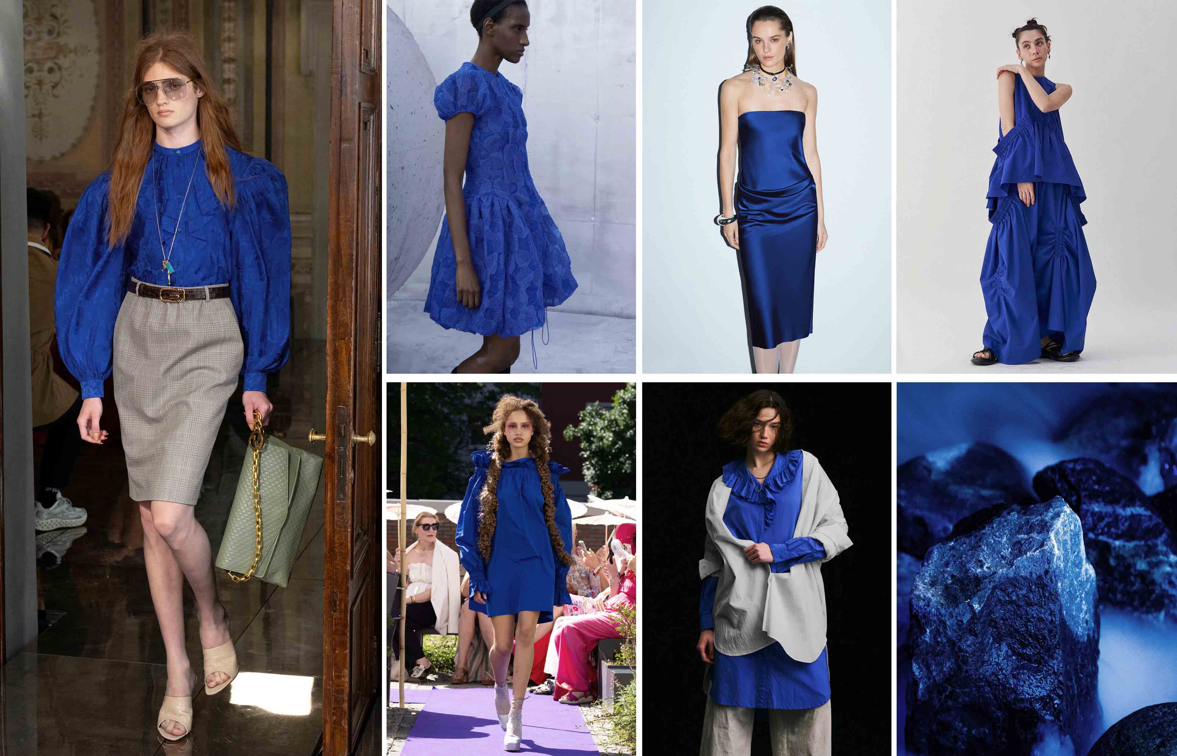
1.Deep Sea Wave Blue
Inspired by lapis lazuli pigment, Deep Sea Wave Blue transcends time and connects traditional dyeing techniques with contemporary technological advancements. It also symbolizes the key to the integration of human intelligence and machine intelligence. With artificial intelligence profoundly influencing the world, only by balancing the depth of human culture and technological innovation can true progress be achieved.
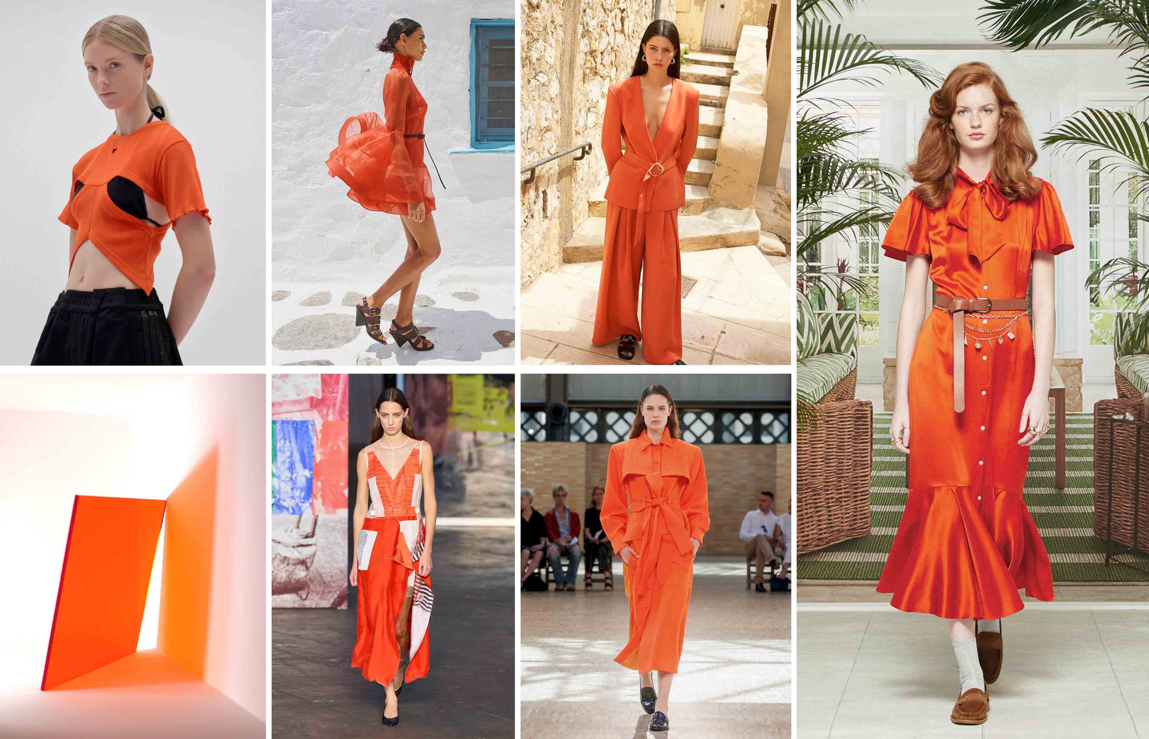
2. Vermilion Orange
Vermilion Orange is a highly saturated color. In the context of increasing climate challenges and uncertainties, it not only responds to the urgent need for adaptability and innovation in design, but also conveys a strong sense of security and psychological protection value. It can evoke collective resonance, drive action, enhance confidence and optimism, and become an important visual medium in combating global anxiety.
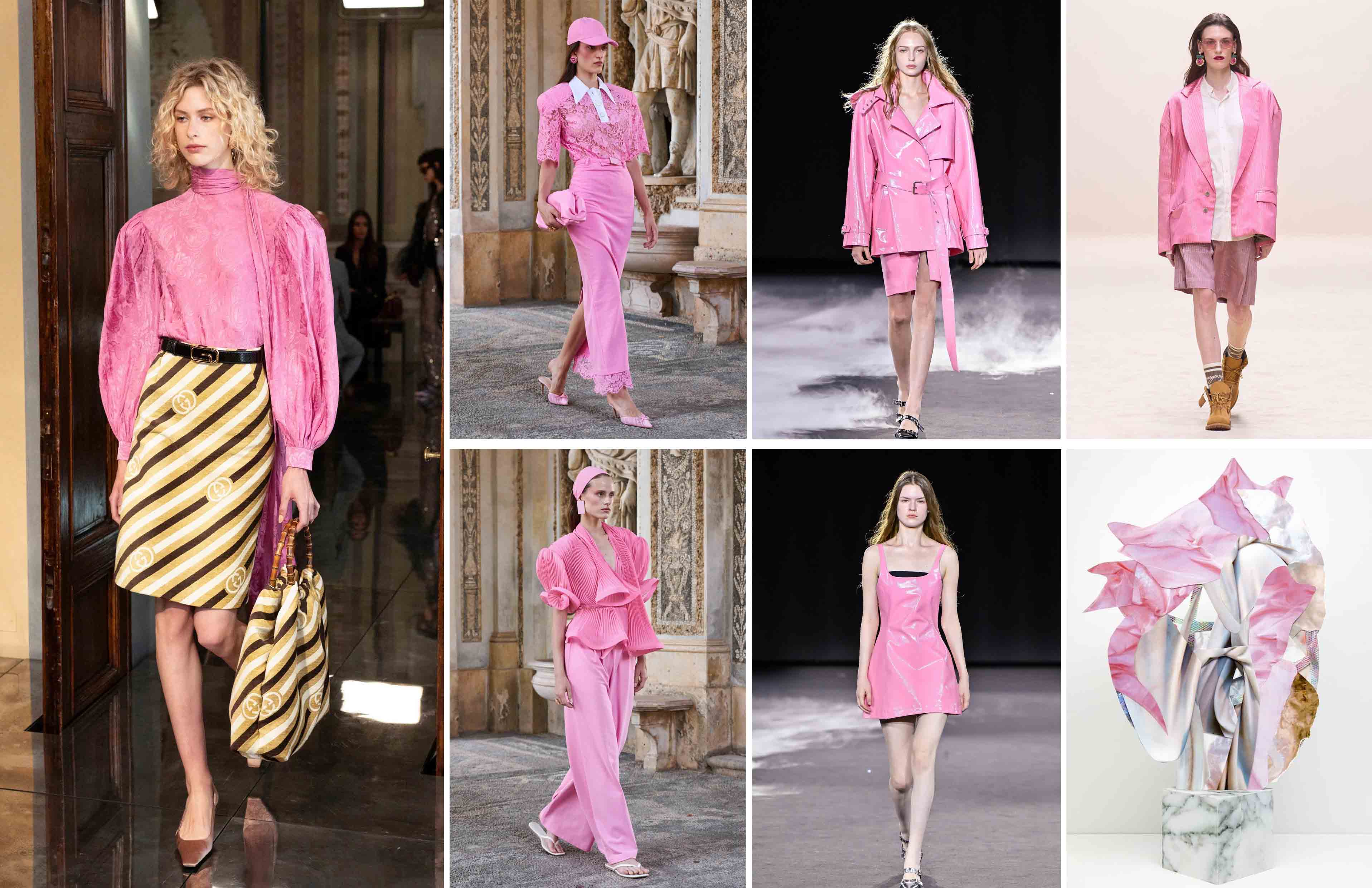
3. Peony Pink
Peony Pink exudes a sense of joy and freedom, echoing the fun-seeking and happiness-creating concepts that consumers and enterprises are striving for in 2027. The design needs to meet the "playful" needs of all age groups, and will also promote self-exploration, interpersonal connections, and cultural innovation. Its inspiration comes from the nostalgic mood of millennial pink, influenced by pop art, and combines retro aesthetics with forward-thinking.
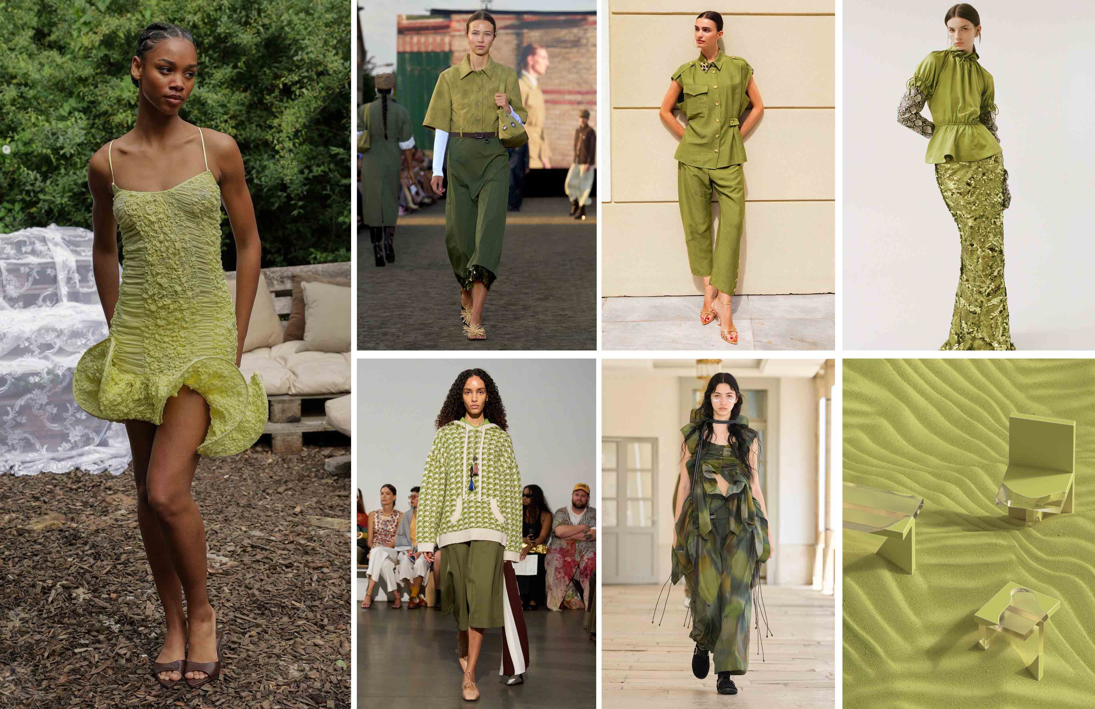
4. Moss Green
Moss Green is a calming and nurturing intermediate green color that resonates with people's emotional transformation of slowing down, returning to authenticity, and valuing interpersonal connections and deep experiences. Its inspiration comes from the grassland ecosystem, symbolizing the dual meanings of ecological reconstruction and spiritual restoration. It also carries a profound vision of rebuilding nature and restoring symbiotic relationships for future generations.
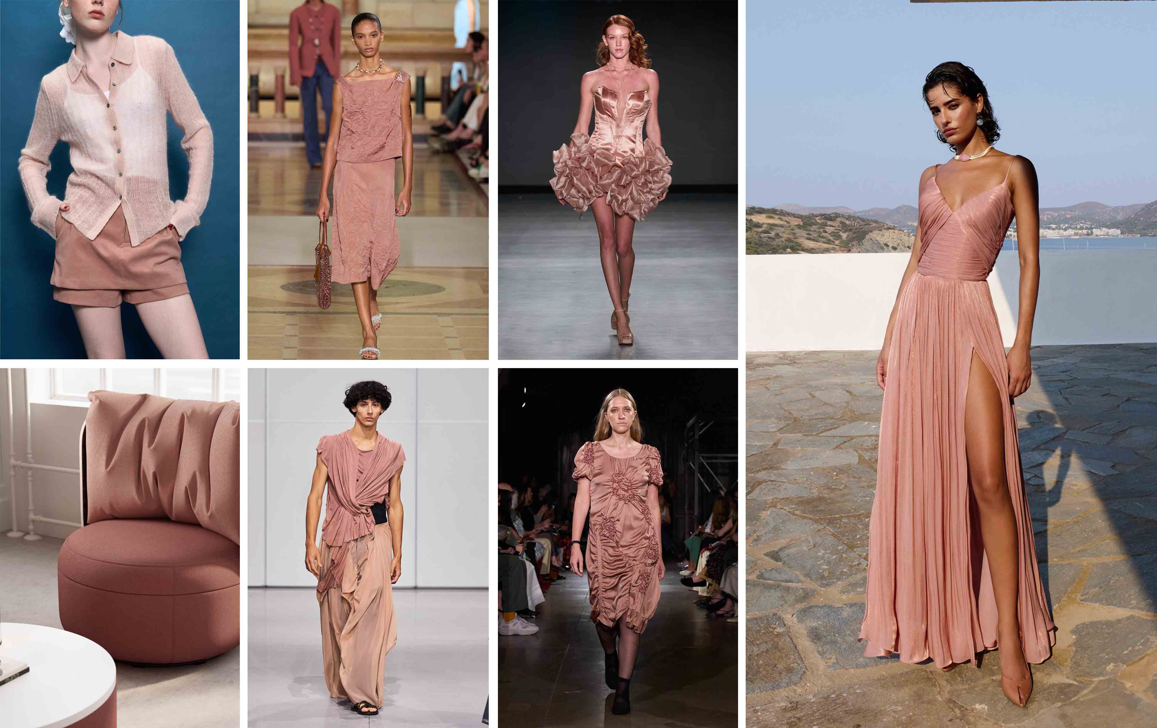
5. Bean Paste Color
Bean paste color is a warm and simple neutral shade of pink, combining credibility and tenacity. In the context of global warming, it has gained attention due to its natural cooling properties. It is both aesthetically pleasing and practical, connecting the past and the present. It responds to modern challenges with classic materials. Its stable texture evokes a deep connection between humans and the universe, originating from the desert landscape that binds humans and nature.
Post time: Oct-17-2025